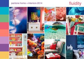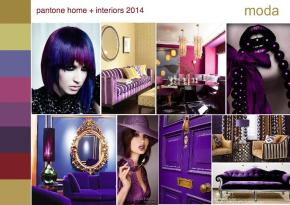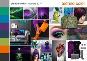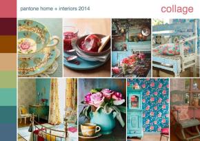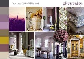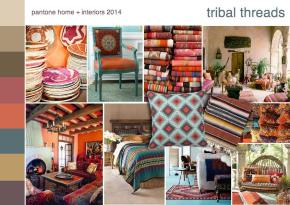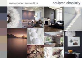
Home and Housewares Trend 14 | Crayon Brights
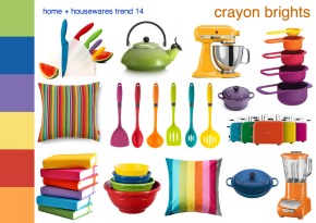
Concept and information: Tom Mirabile | Color trend board created using SampleBoard’s mood board creator program A note-worthy bright crayon color movement was noticed at Milan last year at their International Home Show, MACEF. Crayon brights… Continue reading